
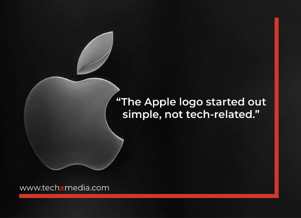
Imagine a bite-sized apple, sleek and simple, instantly recognizable worldwide. That’s the Apple logo we know today, but its journey from a detailed illustration of Isaac Newton to a minimalist icon is packed with fascinating tidbits.
From Renaissance Relic to Rainbow Delight (1976-1977)
Apple’s first logo, a detailed etching of Newton under an apple tree, was more suited to a dusty library than a tech company. Thankfully, 1977 saw the arrival of the iconic bitten apple designed by Rob Janoff. This revolutionary symbol, boasting vibrant rainbow hues, stood out in an era of monochrome logos. Fun fact: the bite mark wasn’t a tribute to Alan Turing, but a way to differentiate the apple from a cherry and accommodate the company name within the design.
Minimalism Takes a Bite (1984-1998)
Subsequent years saw subtle refinements. A modern typeface emerged in 1984, followed by a shift towards a sleeker, monochromatic design in 1998, reflecting Steve Jobs’ vision of Apple as a luxury brand. Special editions, like the translucent blue for the Bondi Blue iMac and the aqua for MacOS X Cheetah, marked the company’s evolution.
A Timeless Symbol of Innovation (Today)
Today, the Apple logo, whether rendered in black, white, or gray, remains a symbol of simplicity, elegance, and innovation. Its versatility shines across applications, maintaining a premium aesthetic synonymous with the brand. This literal yet abstract representation of the company’s name continues to embody Apple’s commitment to minimalist excellence, solidifying its status as a global icon in the tech realm.